It will have perhaps become apparent from this weblog that I do not like many things that others find acceptable (through ignorance, apathy, or other reasons), such as ghostwriting, or the notion of changing authors' works after they have died in order to modernise them.
Today, though, I will be contemplating another form of modernisation, and one that I'm not sure which school of thought I fall into regarding it: that of the modernisation of book covers. The saying goes that we should never judge a book by its cover (which metaphorically can also transfer to the advice that we shouldn't judge people before we get to know them), but the fact of the matter is that people do judge real books by their covers, and that this can make or break a book's sales.
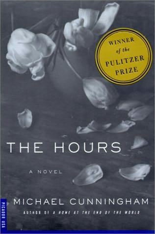
I cannot pretend that I know very much about publishing or marketing, but one thing that is clear to the average Joe is this: books today are only very rarely sold with a monotone cover, bearing only the name of the author and its title (and possibly its publisher). There is a reason for this: many average book-buyers (or at least the ones that the industry is trying to attract) have short attention spans and are drawn in by bright colours and modern illustrations. They are unlikely to be attracted to a book that looks too traditional, boring or plain, and consider "the classics" in particular to be boring, irrelevant or too hard. Books that are published in such a format today seem to be titles that are already of elevated status, such as the titles in Penguin's Popular Classics, which are bright lime green with white lettering, and which bear the names of such luminaries as Wilkie Collins and F Scott Fitzgerald.
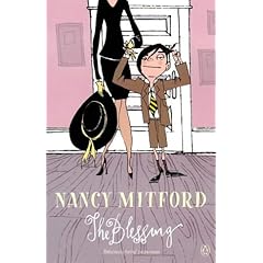
The idea that classic novels, such as those by Charles Dickens, transcend the trend of every modern book cover having to have an eye-catching picture or font (because they will sell anyway) is slightly fallacious, though: despite the above example of the Penguin Popular Classics, the publishing industry will always be trying to boost sales of classics (as well as of books in general), so it does not necessarily follow that classic authors should be immune to this treatment. Stella Gibbons (I'm thinking particularly of her novel Nightingale Wood, which has been updated by way of illustrations by Sophie Dahl) and Jane Austen have both had their books' covers updated in the past few years; in fact, the updated Jane Austen covers more resemble a Sophie Kinsella novel than a classic body of work that is by now nearly two hundred years old in its entirety.
This is, though, by no means the first time that publishers have tried to update or alter book covers in a desperate bid for more sales. It is quite common for the cover of a book to change between its hardback and paperback publications; the trick of republishing a book once it has been made into a film, only to have the cover bearing the stars of the movie in question, is by no means unheard of; and perhaps most famously, the Harry Potter series by JK Rowling was reissued with different covers for adults because there was a sufficient market for adults who wanted to read the series but who were too embarrassed to be seen with a children's book.
But perhaps the most important question is: does it work? Have publishers caught on to a successful tactic, or are their attempts to boost sales in this way in vain? A quick peruse of the WHSmith and Waterstone's bestseller charts this week shows that all of the books, without exception, have big bold letters, bright colours, and modern illustrations. Maybe the publishers are onto something here; maybe, tapping into human nature, we find that everyone does judge the book by its cover after all.
First three Chapters....
16 years ago


